

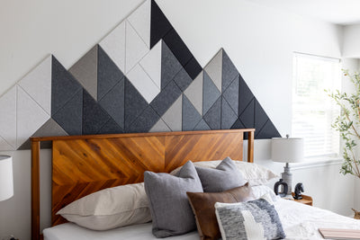


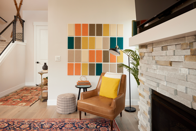

Favorite Colorways


What Are Felt Right Tiles Made From?
Each Felt Right tile is made from high-density, engineered PET felt that has a warm, wool-like appearance but is also very durable and wear-resistant! Our tiles come from 50% recycled single-use plastic that has been broken down into fibers and sterilized without harmful chemicals. These fibers are dyed and felted together into sheets which we then cut down into different shapes. Each tile is 9mm and has precision-cut, chamfered edges.
How Do Felt Right Tiles Contribute to Healthy Indoor Air Quality?
Felt Right tiles adhere to strict quality standards and ensure our products do not contain any red-list chemicals or materials harmful to your health. Our materials have also been tested to confirm they do not emit any harmful gasses into the places where you install your designs.
Where Are Felt Right Tiles Made?
We make our felt panels in-house in Draper, UT. Our headquarters are located at the base of the beautiful Wasatch Mountain Range, which provides a backdrop almost as beautiful as our custom felt wall designs.
What Is Required to Install My Felt Right Tiles?
We use easy-installation methods for our felt tiles that only require a tape measure, level, and pencil. After aligning your first few tiles, your design should be easy to complete. Most felt wall designs take less than an hour.
Are Adhesive Tabs Included in My Felt Right Order?
Every order of Felt Right tiles comes with plenty of adhesive tabs for installation. We also provide a few extras just in case you lose a few.
Can I Purchase Extra Adhesive Tabs?
Yes. To purchase extra adhesive tabs, visit our Adhesive Tabs section under the "About" tab.
How do I install Ceiling Products and Hardware?
Here you can find some helpful Youtube videos with descriptions on each video:
How to use Flat Ceiling Hardware
How to use ACT/Drop Ceiling Hardware
How to install Ceiling Cloud Baffles
Are Felt Right Tiles Safe For My Walls?
Yes. Felt Right tiles utilize our proprietary, removable adhesive and can be uninstalled damage-free when removed properly. Upon removal, the tile is first separated from the wall, leaving the tabs on the wall surface. The tabs are then removed from the wall by rolling them off with your thumb or fingers.
Can I Relocate a Felt Sound Panel Once It’s in Place?
Of course. We include extra adhesive tabs in all of our orders. These extra tabs let you reposition one or two tiles during the installation process. If you need to move more tiles, you can always order extra adhesive squares.
Can the Acoustic Felt Wall Panels Be Used in Ceiling Applications?
Yes, you can use Felt Right tiles in ceiling applications. However, we do recommend using Felt Right Commercial-Grade adhesive tabs to create a stronger, semi-permanent bond when installing sound-dampening ceiling tiles.
Can Felt Right Tiles Be Used in Flooring Applications?
You should not use Felt Right tiles for flooring applications.
Do the Tiles Stick to Textured Walls?
Felt Right adhesive tabs conform to most surfaces including lightly textured walls. We recommend switching to our Commercial Tabs at checkout if your walls are Cement, Cinder Block, Brick, or highly textured.
How Long Does it Take to Ship an Order?
Most orders ship from our factory within 2-4 business days. Occasionally, this lead time may be extended to 5-6 business days for larger orders, or if we are super busy. If you need your order by a specific date, please reach out to us at support@feltright.com, and we will do everything we can to accommodate.
Do you ship internationally?
Yes, we do! You can calculate shipping rates during your checkout.
How do I uninstall felt acoustic panels without damaging the paint?
There are two important steps to uninstalling felt Right tiles without damaging paint:
Step 1: Carefully separate each tile from the adhesive tabs.
Tiles are removed, leaving the tabs on the wall surface. This is done by inserting fingers between the tile and the wall, away from the tab location, and gradually applying pressure until the tile separates from the tabs. Avoid pulling the tile directly away from the wall in an abrupt or forcefully, as the tile needs time to release from the tabs. Avoid pulling the tile directly away from the wall abruptly or forcefully, as the tile needs time to be released from the tabs.
Step 2: Roll the tabs off the wall. Once the tile has been removed from the wall, leaving the tabs, then remove each tab from the wall. This is done by starting at a corner of the tab, applying pressure, and rolling the tab off of the wall with your finger or thumb. Avoid pulling the tab directly away from the wall.
If you have difficulty getting the tab to begin rolling, you can use a block pencil eraser to start the process.
If for any reason you are not satisfied with your purchase, you may return it within 30 days of purchase and we will refund you minus the cost of shipping (or you may ship it yourself).
Your refund will be processed within 14 business days of receiving your returned items.
We accept orders up to $1,000 and charge a 15% restocking fee for orders between $1,000 and $3,000.
We do not accept returns for orders over $3,000, Room Dividers, Ceiling Baffles, or Desk Dividers.
We limit returns on large orders because we custom-fabricate tiles for each order rather than store excess inventory as part of our effort to minimize our environmental footprint.
Please note that orders placed within seven days of each other will be counted as one order and are subject to the terms listed above.
What Is the Best Sound Dampening Material?
High-density felt, like the material used in Felt Right tiles, is one of the best sound-dampening materials. It effectively absorbs sound while being aesthetically pleasing and eco-friendly. Other great options include foam panels and fiberglass.
How To Soundproof a Room?
While soundproofing a room can be useful for those who require absolute silence, it's unnecessary for most people because it involves more than just adding acoustic panels. You’ll want to seal gaps around windows and doors, install thick curtains, and add dense materials like mass-loaded vinyl or extra drywall to block outside noise. In addition to being time-consuming, soundproofing a room is also very expensive. Alternatively, you could install Felt Right tiles to reduce internal noise within the room.