Can Color Change How You Feel?
Color and emotion are inextricably linked. Whether you notice it or not, every color can change your mood. In a living space, the intentional use of color can subtly enhance your space, complementing your decor. Yellow and green are vibrant and ideal for a living room; shades of brown and blue are less stimulating and might be better suited for the office.
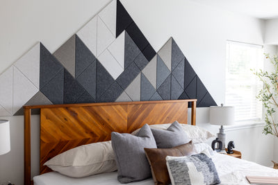
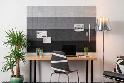
Painting your walls or incorporating decor like rugs, lamps, and art are some ways to imbue your spaces with color. Using Felt Tiles, like those from Felt Right, is another option, albeit one that allows for a high level of customization and dampens sound. In this article, we'll go over how understanding the psychology of color can encourage a certain mood in your space, whether that’s a sense of calm, engagement, or relaxation. We'll also cover how to combine colors in interior design and what role high-end felt acoustic panels play in creating colorful, peaceful spaces.
Color Psychology
Color has the ability to alter your mood and inspire reactions. By hanging felt tiles in your home or office, you can use color as a tool to encourage productivity, spur optimism, or even motivate confidence. But it’s important to first understand the dynamics of color psychology.
From calm colors to happy colors and everything in between, we’re taking a closer look at the emotions that certain colors can evoke:
- Red: Courage, passion, excitement, leadership, love, confidence, strength, warmth, energy, willpower
- Orange: Enthusiasm, fascination, happiness, determination, attraction, success, encouragement, stimulation
- Yellow: Optimism, warmth, confidence, self-esteem, extraversion, emotional strength, friendliness, creativity
- Green: Health, freshness, growth, vitality, productivity, invigorating, nurturing, connection
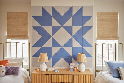
- Blue: Confidence, communication, trust, efficiency, serenity, calm, sympathy, flexibility, grounding, empathy
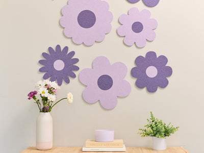
- Purple: Power, nobility, luxury, ambition, wisdom, dignity, independence, creativity, richness, abundance
- White: Wholeness, purity, cleanliness, safety, order, hope, innocence, quietude, meditation
- Black: Elegance, formality, mystery, impact, intrigue, sophistication, prestigious, unknown, versatility
- Brown: Honesty, stability, maturity, predictability, seriousness, reliance, support

Interior Design Color Schemes
Colors play a crucial role in influencing mood and atmosphere in interior spaces. Here are some interior design color palettes designed to create specific environments in various living spaces:
Calm Living Spaces
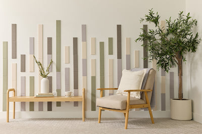
This curated color scheme creates a serene and relaxing living area; consider using a soft, muted palette. These colors can help you unwind and feel at peace in your home.
- Main Colors: Soft blues, gentle greens, and light greys.
- Accent Colors: Pale lavender, creamy whites, and muted taupe.
This color scheme encourages calmness and tranquility, perfect for a living room or a reading nook.
Energetic Living Spaces
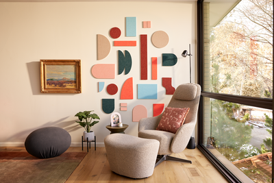
For spaces where you want to feel invigorated and lively, vibrant colors can make a significant impact. These hues are ideal for areas where you entertain guests or want to feel active.
- Main Colors: Bold yellows, bright oranges, and vibrant reds.
- Accent Colors: Crisp whites, light woods, and metallics.
This combination of colors promotes enthusiasm, creativity, and social interaction, making it great for kitchens and living rooms.
Gaming Spaces
Gaming areas benefit from dynamic and stimulating color schemes that enhance focus and excitement. Consider using a mix of dark and bright colors to create an immersive experience.
- Main Colors: Deep blues, blacks, and dark purples.
- Accent Colors: Neon greens, bright reds, and electric blues.
These colors help create a high-energy atmosphere that is perfect for gaming, ensuring both concentration and excitement.
Office Spaces
Productivity and focus are key in office spaces, so colors that promote these qualities are essential. Opt for a balanced mix of neutral and cool tones to create a professional yet comfortable environment.
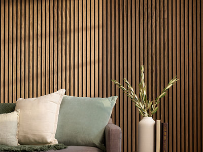
- Main Colors: Cool blues, greys, and soft browns.
- Accent Colors: Fresh greens, muted yellows, and crisp whites.
This scheme supports efficiency and calm, making it ideal for home offices or study areas.
Applying Color with Felt Tiles
Using Felt Tiles, like those from Felt Right, allows for high customization and sound dampening, enhancing the functionality and aesthetic of your space. Whether you're looking to create a calming sanctuary or a vibrant social hub, these tiles provide the flexibility to match your desired color scheme.
Benefits of Felt Tiles:
- Customization: Easily create unique designs that reflect your personal style.
- Sound Dampening: Improve the acoustics of your space for a quieter environment.
- Visual Appeal: Add texture and color to your walls, making your space visually interesting and dynamic.
By understanding the psychology of color and thoughtfully selecting your color schemes, you can transform any room to suit your needs and preferences. Use Felt Right's My Studio design tool to experiment with different combinations and find the perfect match for your home. Explore the Designs page for more inspiration, and start creating your ideal space today.
Explore the Possibility of Color with Felt Right Designs
See color theory at work in a few of our best-selling felt tile and felt board designs. Ruby makes Metropolitan a statement piece that lends a passionate and energetic air to this workspace. See Metropolitan.

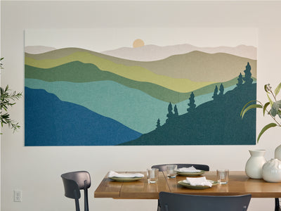
Palm is a stunning ode to nature and one of our newest colors; this muted green promotes growth and vitality in a picturesque cabin getaway. See Wabi Sabi.

Our icy shade of Baby Blue encourages efficiency and calm in an aesthetically beautiful way, perfect for this home office. See Atlas Polar.

The opportunities for color combination are endless with our beautiful wool-like acoustic felt wall tiles. Consider the feeling and energy you wish to bring to your space and how you can combine shades of our proprietary color palette to achieve that atmosphere.
Start curating your own design in Felt Right’s My Studio design tool, or check out our Designs page for color and design inspiration created by our in-house team. Take advantage of the power of color by transforming your walls with Felt Right felt tiles today.

