How to Transform Your Surroundings with Color: Deeper Shade of You.
I’m Lori Weitzner, Color Mentor and Founder of Lori Weitzner Design, and I’d like to talk about the power of color and how this connection can transform your home, your mood, and the way you see the world.
Color communicates on an emotional level, influencing our moods and evoking the memories and sensations we might associate with a beloved book, a meaningful song, a meal on a long-ago vacation, or even a favorite scent. I believe not only in the power of the colors we take in, but also in the language of color we speak into the world as we decorate our lives. Without a doubt, color is a basic form of self-expression.
I’m excited to work with Felt Right as they continue to expand their collection of colors, allowing their creative customers to best express themselves.
My Journey with Color
I enrolled at Syracuse University with the dream of becoming a painter. However, during my studies, I was exposed to the world of textiles and the beauty and complexity of the materials that decorate our everyday lives. Since then, I’ve never looked back. After selling my textiles throughout Europe, I worked in product design for companies like Estee Lauder and Calvin Klein. As a Design Director at Jack Lenor Larsen, I unveiled Weitzner Limited—an innovative line of wall coverings and textiles that are sold worldwide.

Photo credit: Scott Jones
As I’ve worked with amazing companies and individuals over the years, I’ve still never lost my initial fascination with color. Vibrant shades of reds, blues, and greens have the power to shape our moods, decisions, and influence how we see the world around us. Color, simply enough, adds flavor to our lives and enables us to express ourselves.
To honor the power of color, my book “Ode to Color” explores ten “color worlds” and beautifully illustrates how to enhance our lives by harnessing the capacity of color to influence our tastes, decisions, and moods. I combine this emotionally grounded approach with a global perspective, celebrating the complexity of color to create sophisticated palettes that resonate deeply with our lives. Through a research-driven and engaging questionnaire, I help others discover the color world (or worlds) that will help them live well with color.
You can take my personally curated “Ode to Color” test here.
Weitzner's Spring Color Palettes for Felt Right: Early Spring Pastels + Full Bloom Spring
I believe that colors played a major role in drawing me into the world of textiles and interior design. I still get excited by the possibilities presented to us by color and how we can use unique and vibrant colors to transform our homes and lives.
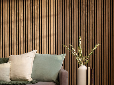
We all experience colors on a very personal level; however, color theory has shown that certain colors create distinct moods and experiences. By delving into color theory (in tandem with my book “Ode to Color”) you can design your home or office to express a specific mood or feeling, especially with the use of decorative wall tiles.
Blue, for example, promotes a sense of calm, peace, order, and stability. Shades of orange, on the other hand, can bring energy, warmth, and flamboyance to your home. Reds will add energy, passion, and excitement, while green represents renewal, good luck, and a connection with the natural world.
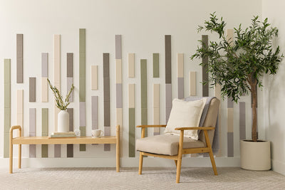
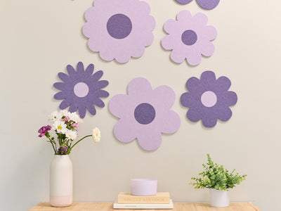
In honor of spring, I created two special palettes of Felt Right's color-focused wall designs. The first is Early Spring Pastels, designed to evoke the mood of the first moments of spring: soft grey mists, quiet blue mornings, new pink petals, and the tender green of buds just starting to sprout.

The muted-yet-memorable palette captures the energy of new potential in six hues: zinc, latte, kiwi, baby blue, coral, and porcelain. Even as their softness inspires ease and comfort, an underlying mineral tone keeps the colors grounded, making them attractive but not demanding to the eye. A perfect fit for the bedroom, bathroom, and other spaces of home, or to inspire ease in the spaces we gather and work.
I also created a more saturated color palette I call Full Bloom Spring. This palette captures the vibrancy of a season in full swing: heady greens, clear skies, and floral oranges so rich you can almost smell the tangerine blossoms they call to mind. Six unique colors comprise the palette: moon, sky, aqua, aries, fresh lime, and citrine. It’s a palette to transport you directly to a garden of delights – an ideal match for the kitchen, office, studio, or any other space in need of a refreshing splash of color.
How Felt Right Customers can Explore and Incorporate Color into Their Own Homes
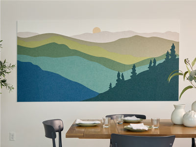
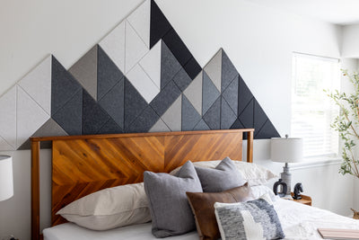
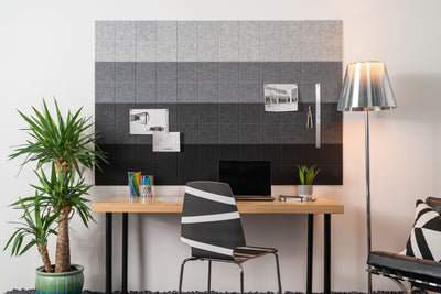
Felt Right tiles allow you to incorporate my color theory into your space intuitively, in combination with dynamic texture, sound dampening panels, and durable functionality. Create a unique headboard with a felt tile board in soothing hues to inspire sweet dreams or add a pinboard to your workspace in bright colors that motivate creative thinking.

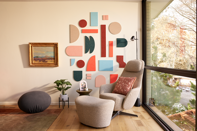
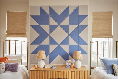
Go for a big visual impact with a living room felt tile wall installation and infuse your space with your personality by choosing colors that evoke your happiest memories. Bring energy to any space with an accent wall featuring a geometric felt tile design in a bold shade that pops against your paint or wallpaper.

Or you can create a cohesive color identity with felt tiles that mirror the fibers of your antique rug or the cover of your coffee table book. There are as many ways to bring color into your space as there are colors to choose from.
Get started by using Felt Right’s My Studio design tool to imagine how color can transform your home by customizing pre-set templates or designing freestyle, exploring different combinations of shade, shape, and scale.
