Exploring Felt Right Colorways
Color Theory and Why It Matters

Color is one of the fundamental elements of design and can be used to drive the inherent character of a space. For the everyday consumer, it can be overwhelming to assemble a scheme that perfectly complements the palette of your home, workspace, or business. At Felt Right, we want to provide you with the knowledge necessary to create a perfectly curated Felt Right felt tile design for whatever function you need. Whether it be a pin-board for your home office or a statement piece in your living room, our felt wall tiles are the perfect design piece to bring your space to life.
Felt Right is the industry leader in creating high-quality felt tiles and felt boards for your home, office, or any interior space. Felt wall tiles instantly provide texture, warmth, and color to your walls. With a wide array of colors, patterns, and felt tile designs, you can easily transform any wall in your home or office into a work of art. And with a natural sound controlling quality, these acoustic wall tiles can even help you control excess noise.
Color Harmonies
Color harmonies are an integral principle in color theory and a great starting point when pulling together a color scheme in your home or office. Below, we have created a visual element for these common harmonies using our own Felt Right color palette. You will see what defines each color harmony and what tone they strike when implemented in a space.

Primary
Bold and vibrant, even distribution of color and tone

Analogous
Subtle gradient combination, typically built around warm or cool colors

Monochromatic
Subtle and conservative color combinations, great way to use color as a neutral

Triadic
High contrast palette that is more versatile than a standard complementary combination

Split Complementary
Bold scheme, works well if one color is dominant and the analogous colors in the palette work as accents


Our Favorite Color Combinations

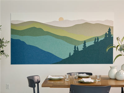
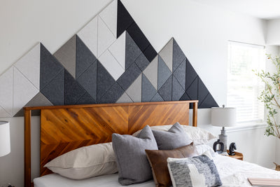
Reminiscent of an icy cold tundra, this predominantly cool color palette brings to mind harmony and calm. Cool palettes are passive and appear to recede relative to their background, perfect for a subtle accent piece. This felt tile design combines our Zinc, Baby Blue, Slate Blue, and Cast.

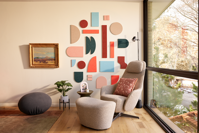
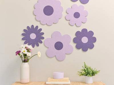
With a striking interplay between warm grays and fruit-like hues, this palette conveys the sentiment of refreshing and energetic pinks and oranges with a muted balance of low- saturated tones. This felt board design combines our Zinc, Moon, Nickel, Coral, and Aries.

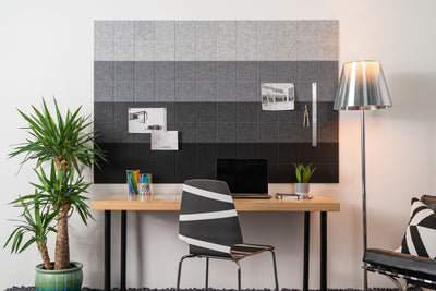
Go boldly black and white with this triptych design that explores brilliant gray- scale transitions with an ode to pixel-style construction. This monochromatic neutral palette communicates sophistication and luxury. This felt wall tile design combines our Zinc, Nickel, Armor, Mineral, Cast, and Ebony.

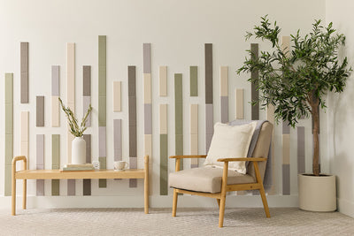
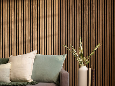
The warm neutrals and muted greens of this palette are reminiscent of nature and the lush undertones of the late summer season. Introduce this palette into your space for organic inspiration. This acoustic felt tile design combines our Latte, Sage, and Palm.

Variables that May Affect a Color’s Appearance
Understanding the interaction of colors and the environment they live in is a vital part of the design process. The presence of varying light temperatures and surrounding colors and materials will have a very noticeable effect on the appearance of a color. To confirm that a certain color meets your needs, we recommend testing a sample (i.e. one felt wall tile) within your space at different times of the day.
Surrounding Colors
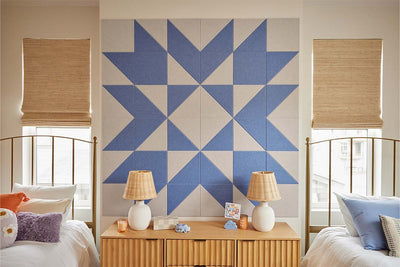
The context of a material and its surrounding colors will influence how it appears, as well. Notice how our Cayman Blue appears to be a different hue when compared to its complement, Aries, then when it is compared to a muted monochrome hue like Slate Blue.


Reflected Color
Transform the Color in Your Space with Felt Right
It’s truly amazing what color can do for your interior space. By using certain colors to create a unique color harmony, you can influence and alter the mood and atmosphere in your space.
Start curating your own color harmony for your home or office with Felt Right’s My Studio design tool. You can also check out our Designs page for color and design inspiration created by our very own in-house team of color experts and enthusiasts.
Take advantage of the power of color by transforming your walls with Felt Right felt tiles today.

